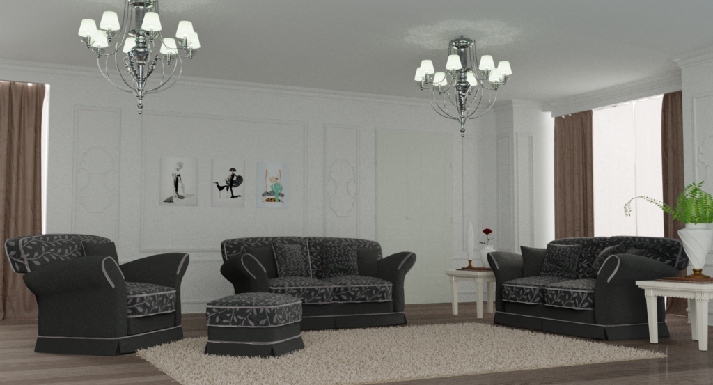
I worked a long time on this scene, even accounting for the fact that it reuses the potted plant I’d previously posted. There’s just so much stuff in it, the detailing on the walls for example, plus modelling the chandeliers, working out ways to make the curtains look not horrible. And even after all that time spent, it’s still far, far from perfect. You can view a larger, uncompressed version of the image by clicking this.
I ought to have spent even more time making the carpet look good by giving it more variation for example. The scene also looks kind of flat because I haven’t made the lighting dramatic enough. I needed to make the light coming through the windows really, really bright to make it look interesting, but then making it too bright would have caused it to completely saturate the curtains. For the most part, I think my modelling is good enough. But I think to figure lighting out.

This next one is another project by CG Geek and I suppose that my attempt is sort of a failure. The version he does is much more ambitious and great looking than what I made. I mostly could follow along with the instructions well enough but I soon realized the processing time for the fluid simulation and the final rendering to do everything that he does would be far too daunting and so scaled back my ambitions appropriately. The problem with animations like this is that you really need to do things over and over again to tweak things and manually adjust the settings so that it all looks good. That’s just soul-killingly tedious when you need to keep waiting so long between iterations even for a preview of what it might look like. Now that I know what to do, I might revisit this in the future in some other form.

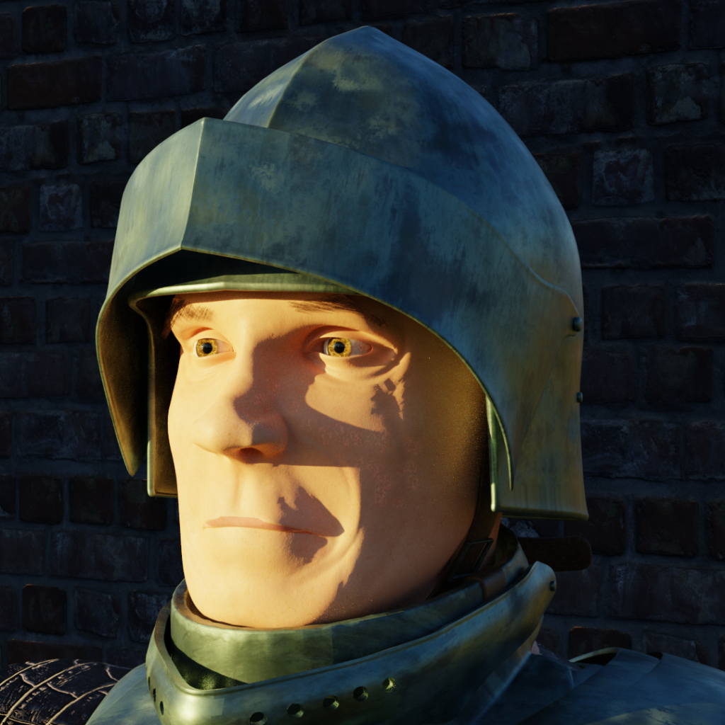
I’ve mostly finished now with Riven Phoenix’s human modelling course and so this is just a simple render to show it off. Obviously the skin shaders used here are bad. After mucking around for a while, I found that there’s no way I have the 2D skills to manually paint a decent skin texture. I did however use it as an exercise to practice sculpting a little bit. I was also fun to make more realistic armor pieces now that I have a realistic model to base the correct proportions around. Not bad as a cartoonish kind of art style I think.

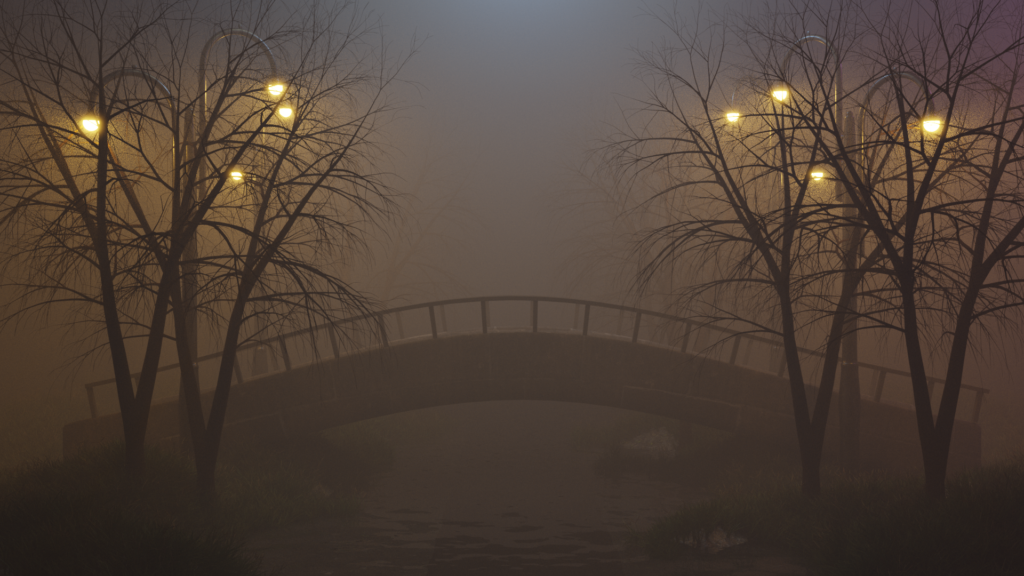
Finally, here’s a project from a new YouTube channel I’ve been following, sumit bose, though he doesn’t seem to have posted many videos so far. Again mine isn’t as good as his. I can’t seem to get the water in mine to properly catch the reflections off of the lamps. The modelling work here is trivial but I really enjoyed this as an exercise in how to use various lights to make a fog enshrouded scene look good. It’s exactly what I was talking about earlier. It’s not actually realistic but it has lights coming in off camera from nothing that doesn’t make sense in real life. But it’s artistic and you can’t argue with the results.