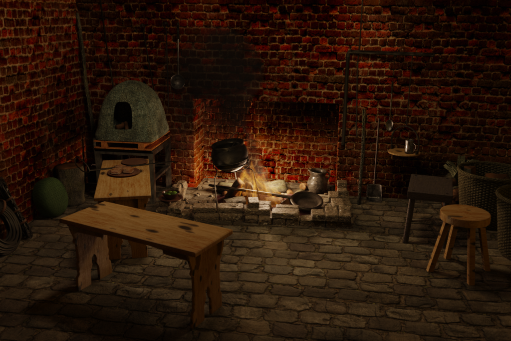
Blender 2.82 dropped late while I was working on this latest batch of scenes, too late for me to update and learn it so all this was done in 2.81. That was a bit of a pity as well as one of the new key features is that it incorporates a completely new fluid simulation system called Mantaflow. I could have used for the fire in this first scene, but oh well.
One of my very early renders was a fireplace scene that took a long, long time to render. That’s because it’s really hard to generate enough illumination to light a scene purely from the fire. This time around I faked things with most of the light coming from artificial sources. This one took very little rendering time. I then wanted to combine this with a kitchen scene with some small objects as my last kitchen scene turned out pretty well I thought. So here’s the result. Not too shabby at all I think, and not too much work at all.

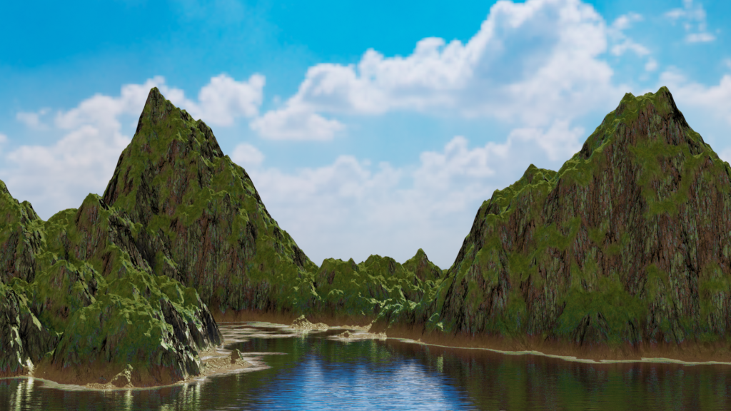
Next is my attempt at following along with this procedural landscape tutorial by Wayward Art Company. This was prompted by how much I hated the low poly stylistic landscape on my last batch of renders. I didn’t spend much time on this at all and sure I didn’t polish it up enough to look anywhere near as good as the original on YouTube, but to me this looks so much better.
I do note that this is all based on clever use of nodes to manipulate a single plane. After all, it does feel overwhelming as you keep laying nodes onto the system. Sometimes it’s easier to break things down into separate elements and place them by hand. And of course you need to render this to be able to see anything as it’s just a flat plane otherwise. I just don’t see how scalable this is or how you would use this in a production project.

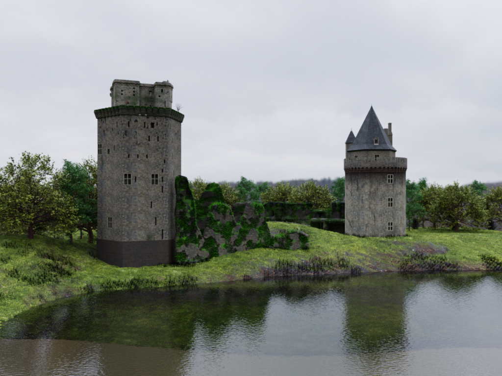
Next up is my own attempt at a landscape scene with some crumbly castles to add color and interest. I consider this a very mixed success at best. I feel very constrained by the amount of vegetation I can put in. Also to really add enough detail to the castle buildings there is no alternative but to spend lots of time sculpting in the imperfections and holes, which I’m too lazy to do. So more of a proof of concept than anything polished.

I’ve always been intrigued by the various hard surface Blender tutorials I’ve seen advertised here and there. As a beginner, modelling smooth, hard shapes seems easy but it rapidly becomes difficult when you need to work in curves, cut holes in smooth surfaces, join different curved sections together etc. all without causing deformations and weird artifacts.
I thought this tutorial from CG Geek would have some good tips in that regard but in the end it was kind of disappointing. The modelling uses only simple techniques like extrusion and he doesn’t even manage to avoid all deformations. He also eyeballs things too much for my liking instead of planning out where he needs things to be properly symmetrical right from the beginning. He is admittedly much better than I am at eyeballing things and intuitively knows when proportions and such just don’t look good but that’s not exactly what I expect out of a hard surface modelling tutorial. I guess I’ll have to look elsewhere.
Finally I think I have at least one more round of Blender renders in me but it’s getting to a point where things in the community are moving faster than I can keep up with, given the time I’m willing to put in. I’ll probably give this up entirely pretty soon and move on to some other hobby.