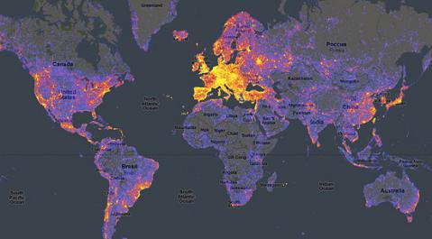
Not much to write about at the moment, so here’s a link to the publicized map of how “touristy” different parts of the world are. What’s interesting about this is that the data is more fine grained than just tourist arrival numbers sorted by country. You can actually see which specific hotspots tourists are flocking too. Of course, it’s all automatically generated based on Panoramio so there’s obvious selection bias in the data. I wouldn’t imagine that many tourists from China for example use the site.
Rather shocking how western Europe is basically one huge tourist hotspot, but some parts of Malaysia are right up there in popularity. You can check out the full map on Google Maps as usual. It seems Google had nothing to do with this. It was just someone’s cool idea to link Google Maps with data from the Panoramio website.