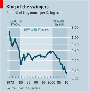
The above chart caught my eye while I was reading through an issue of The Economist. The article is available online here. It basically shows how much gold a US dollar can buy from 1973 to 2010 and uses this as a measure of the dollar’s devaluation. In 1973, we can see that one US dollar could buy slightly less than 2 troy ounces of gold while in 2010, a US dollar can buy less than 0.10 troy ounces of the stuff.
What’s interesting is that the chart is that it also divides the period of time under study into three separate phases and gives a percentage for the change of value in each period. So it notes that the US dollar was devalued by 90% from 1973 to 1980, that it was revalued by 236% from 1980 to 2000, and devalued again by 80% from 2000 to 2010.
The chart is impeccably correct of course, but intuitively if someone told you that something went down in value by 90%, then shot up 236% and then went down 80% again, would you understand that its current value is now about one twentieth of the original? Unless you took the trouble to actually work the maths out, I think most people would be surprised by the actual results.
Anyway, this isn’t really apropos of anything, but since investment returns tend to be stated in percentage terms, I thought it would be a good idea to demonstrate how important it is to actually chart out the real values instead of relying on percentages and using guesstimates. This also demonstrates how valuable a good chart is to help people understand what’s really going on.